
The 3-Color Rule in fashion helps you create balanced, eye-catching outfits by choosing three main colors that work well together on the color wheel. Focus on placing bright tones near your face for energy, while balancing with neutral shades for sophistication. Avoid clashing or overloading on bold hues. If you want to master stylish combos and learn how to break the rule creatively, keep exploring for expert tips and inspiring ideas.
Key Takeaways
- The 3-Color Rule involves selecting three main colors that complement each other using the color wheel for harmony.
- Bright hues near the face energize outfits, while neutrals add balance and sophistication through strategic placement.
- Stylists often incorporate contrasting colors like complementary pairs to create vibrant, eye-catching ensembles.
- Mixing jewel tones, pastels, and neutrals within the three-color framework enhances cohesion and visual interest.
- Creative breaks from the rule, such as bold color blocking, can personalize outfits while maintaining overall harmony.

Knitgrip 3 Pack Neon Sweatbands Set 80s Wristband and Headband Color War Accessories Sports Sweatbands for Summer Ball Party(Mixing Colors)
80S Sweatbands: go all out! This 80s sweatband set includes a neon headband and two neon wristbands for…
As an affiliate, we earn on qualifying purchases.
As an affiliate, we earn on qualifying purchases.
What Is the 3-Color Rule in Fashion?

The 3-Color Rule in fashion is a simple guideline that helps you create balanced and visually appealing outfits. It’s based on the idea of choosing three main colors that work well together, often using the color wheel as a visual tool. The color wheel shows you which shades complement each other, making it easier to pick harmonious combinations. Color psychology also plays a role—certain hues evoke specific feelings or moods, so selecting colors thoughtfully can enhance your look’s impact. By sticking to three main colors, you avoid overwhelming your outfit while maintaining interest and variety. This rule helps you look polished and intentional, whether you choose bold, subtle, or neutral shades. Additionally, understanding color harmony principles can further refine your outfit choices for a cohesive look, especially when considering color contrast to create visual interest. Incorporating color matching techniques can also help you experiment confidently with different combinations to express your personal style.
Set of 30 Color Closet Dividers for Hanging Clothes – Clothing Rack Dividers for Organization
30 durable closet size dividers for organizing clothes from baby to adult; perfect for home and retail use
As an affiliate, we earn on qualifying purchases.
As an affiliate, we earn on qualifying purchases.
How to Choose Your Main Colors for Outfits
Choosing your main colors for outfits starts with considering your personal style and the mood you want to create. Think about how different colors evoke feelings and match your personality. Use seasonal color palettes to guide your choices, such as warm tones for fall or cool shades for winter. When selecting your main colors, consider fabric textures too—smooth silk pairs differently with matte cotton than shiny satin. Visualize your outfit with these elements in mind:
- Rich jewel tones for elegance
- Soft pastels for a gentle vibe
- Bold primary colors for confidence
- Earthy neutrals for versatility
- Bright accents for energy
Balancing these elements helps you craft outfits that reflect your style while harmonizing colors, textures, and seasonal influences seamlessly. Incorporating color matching principles can further enhance your outfit coordination and ensure a cohesive look. Additionally, understanding color harmony techniques can help you create more visually appealing ensembles. Paying attention to color contrast can also make your outfits stand out and appear more dynamic, and being aware of color psychology can add depth to your styling choices. Exploring color theory provides a solid foundation for making effective color decisions in your wardrobe.

240PCS Sew On Rhinestones, Silver Glass Crystal Gems with Claw Settings, 8 Mixed Shapes Flatback Sewable Jewels for Jewelry Making, Costume, Clothing, Shoes & Craft DIY (0.47"–0.71")
【240PCS Mixed Set, 8 Shapes】 Includes 240 sew-on rhinestones in 8 elegant shapes—perfect for building matching sets, mixing…
As an affiliate, we earn on qualifying purchases.
As an affiliate, we earn on qualifying purchases.
Tips for Mixing Colors and Creating Balance
To create a balanced outfit, pay attention to how you place colors, ensuring no single hue overwhelms the look. Wisely incorporating neutral tones can help ground bold colors and add sophistication. By mastering color placement and neutral use, you’ll achieve harmony and style in every outfit. Additionally, understanding color matching fundamentals can guide you in choosing the right combinations for a polished appearance. Recognizing the importance of visual balance can further enhance your ability to create cohesive and appealing ensembles. For example, knowing how color heritage influences your color choices can help you select hues that complement your natural tones and personal style.
Balance Through Color Placement
Balancing colors in your outfit starts with thoughtful placement. When you position your colors strategically, you influence how others perceive your look through color psychology. For example, placing a bold red near your face draws attention and energizes your appearance, while grounding your outfit with neutral tones unifies the overall look. Consider seasonal color schemes—warm tones for fall, cool shades for winter—to create harmony. Visualize your outfit as a canvas:
- Bright hues on accessories to highlight key areas
- Dark shades on larger clothing pieces for contrast
- Light colors on the top to brighten your face
- Deep tones on the bottom for stability
- Accent colors sparingly placed for focal points
Proper placement ensures your outfit feels balanced, cohesive, and visually appealing. Incorporating fabric decorating markers can also add personalized touches and enhance color coordination. Paying attention to color placement helps prevent mismatched or overwhelming combinations, ensuring your outfit remains harmonious. Being aware of passive voice detection can help you craft clearer, more engaging descriptions of your outfit choices. Additionally, understanding electric bike horsepower can inspire you to choose dynamic and energetic color schemes that reflect your personality. Developing an awareness of visual balance principles can further refine your outfit coordination for a polished look.
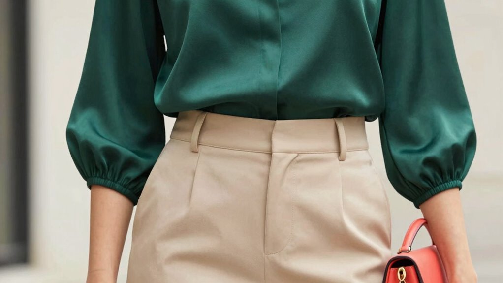
Use Neutral Tones Wisely
Neutral tones are powerful tools for creating harmony and balance in your outfits, especially when mixing bold or vibrant colors. Neutral hues like beige, taupe, and gray serve as a calming backdrop that lets your colorful pieces stand out without overwhelming the look. Subtle shades can soften a striking outfit, making it more sophisticated and approachable. Use neutral tones strategically, such as pairing a vivid top with neutral pants or adding a neutral blazer to a colorful dress. This balance prevents your outfit from feeling chaotic and helps highlight your statement pieces. Remember, neutrals aren’t just filler—they’re essential for grounding your look and ensuring your bold colors shine without clashing. Using color analysis techniques like cotton candy grapes as inspiration, you can incorporate unexpected hues into your wardrobe for a playful yet balanced style. Incorporating visual balance principles can help you craft effortlessly stylish ensembles, ensuring that every element complements the others seamlessly.

Bright Winter Swatch Book/Color Fan
COLOR ANALYSIS: The Bright Winter Swatch Book helps identify your best colors within the Bright Winter color palette…
As an affiliate, we earn on qualifying purchases.
As an affiliate, we earn on qualifying purchases.
Common Color Coordination Mistakes to Avoid
One common mistake in color coordination is pairing too many bold hues without contemplating how they complement each other. This can create a chaotic look that overwhelms your outfit. To avoid this, focus on balancing colors and keeping accessory coordination simple. Overloading with seasonal color trends can also lead to mismatched styles. Be mindful of these pitfalls:
- Mixing clashing bright colors without a neutral anchor
- Over-accessorizing with multiple bold pieces that compete for attention
- Ignoring how colors work with your skin tone and personal style
- Failing to consider the overall harmony of your outfit
- Using trendy colors without balancing them with classic tones
Sticking to a cohesive color palette ensures your outfit looks intentional and polished. Remember, less is often more when it comes to effective color matching.
When and How to Break the 3-Color Rule Creatively

While the three-color rule offers a solid foundation for cohesive outfits, there are moments when breaking it creatively can make your look stand out. Creative color blocking allows you to experiment with bold, unexpected color pairings that challenge traditional rules. Use this technique when you want a statement-making outfit or to showcase your personality. To do this effectively, choose one dominant color and add accessories or clothing items in contrasting shades. Incorporate unexpected color pairings that aren’t traditionally matched but work well together through contrast or harmony. Remember, breaking the rule isn’t about chaos; it’s about intentionality. Trust your instincts and aim for balance, ensuring your colors complement rather than clash, for a fresh, eye-catching look. Understanding color harmony can help you make more deliberate choices when experimenting outside the three-color guideline.
Real-Life Outfit Ideas Using the 3-Color Rule

You can create stunning outfits by incorporating monochrome looks, which use different shades of a single color for a sleek effect. Complementary color pairings, like blue and orange, make your outfit pop and grab attention. For a bold twist, add a bright accent piece to your main color scheme to keep your look fresh and dynamic.
Monochrome Magic Looks
Have you ever wondered how to create a striking, cohesive outfit using just three colors? Monochrome magic looks are perfect for this. They rely on shades of a single hue, playing with color psychology to evoke specific moods—calm blues or energetic reds. When you master this style, your outfits become effortlessly chic. Imagine:
- A sleek, dark navy blazer paired with a lighter blue shirt and deep blue trousers
- Soft blush pink top with a rose-toned skirt and mauve accessories
- Charcoal gray sweater, slate pants, and silver-toned jewelry
- Bright red dress accessorized with crimson shoes and a matching clutch
- Olive green jacket, sage blouse, and forest-toned pants
These monochrome looks highlight your confidence and sophistication while keeping your color palette simple and impactful. Incorporating color matching strategies can further elevate your wardrobe choices, ensuring your outfits are both stylish and harmonious.
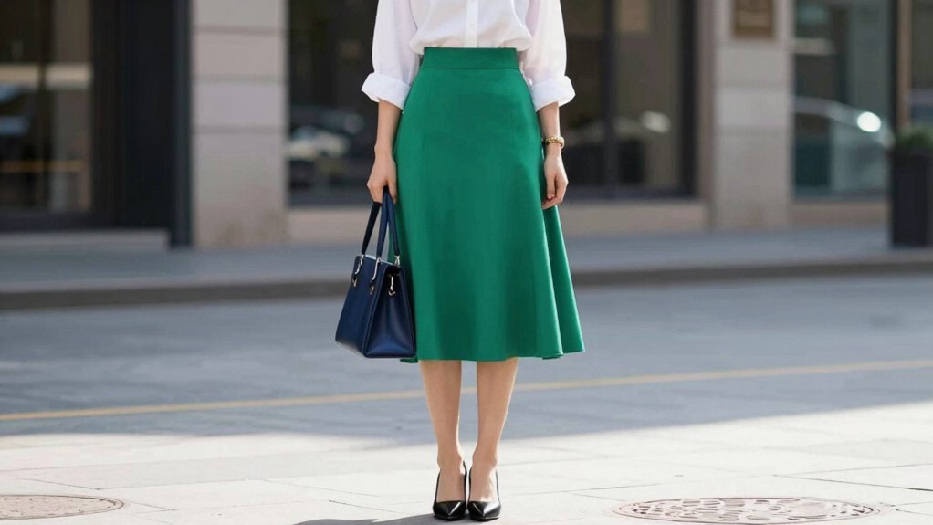
Complementary Color Pairings
Complementary color pairings create vibrant, eye-catching outfits that emphasize contrast and balance. By consulting the color wheel, you can identify pairs like blue and orange or red and green that naturally complement each other. These combinations draw the eye and make a bold statement. Understanding color psychology helps you choose hues that evoke specific feelings; for example, blue can convey calmness, while orange adds energy. When styling, balance these colors carefully—perhaps a blue top with orange accessories or vice versa—so one color doesn’t overpower the other. Color matching principles play a significant role in creating harmony and visual interest in your outfits. Complementary pairings work especially well when you want to stand out or create a lively, dynamic look. Keep your outfit harmonious yet striking by mastering the use of the color wheel and understanding color psychology.
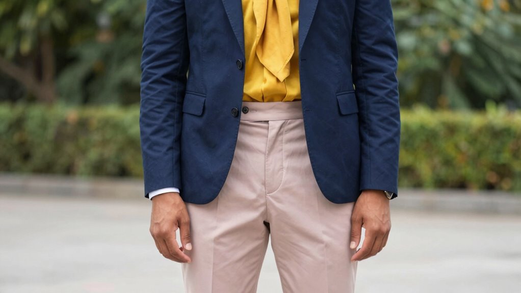
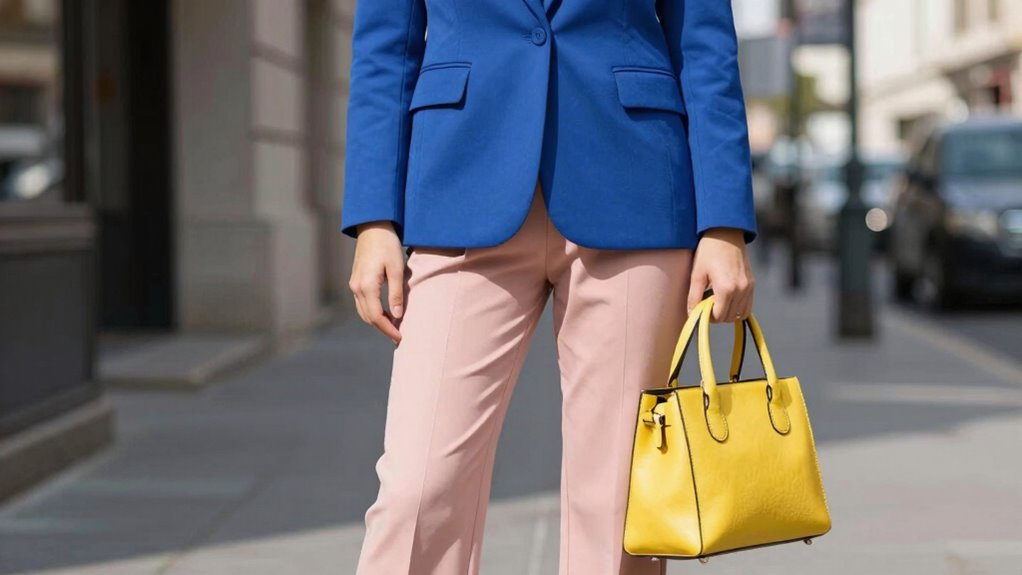
Bold Accent Combinations
Using the 3-color rule for bold accent combinations allows you to create striking outfits that balance vibrancy with cohesion. You can incorporate statement color accents to make your look pop. Think of a crisp white shirt paired with a fiery red scarf, or a sleek navy dress with a mustard yellow clutch. Bold accent combinations work best when you keep the rest of your outfit neutral, letting the statement color accents stand out. Visualize:
- A black blazer with a bright coral pocket square
- A beige sweater with electric blue earrings
- A charcoal suit with vibrant lime green shoes
- A pastel pink skirt paired with bold magenta jewelry
- An olive jacket with striking red sneakers
These ideas demonstrate how to incorporate bold accent combinations seamlessly, creating eye-catching outfits that showcase your style confidence.
Frequently Asked Questions
Can the 3-Color Rule Be Adapted for Formal or Casual Settings?
Yes, you can adapt the 3-color rule for formal and casual settings. For formal color schemes, stick to neutral tones like black, navy, or gray, adding one subtle accent color for interest. For casual outfit ideas, feel free to experiment with brighter or more varied hues, keeping it simple with three complementary shades. This approach keeps your look balanced, whether dressing up or down.
How Do Skin Tones Influence Color Choices Within the 3-Color Rule?
They say “know thyself,” and that’s true for fashion too. Your skin undertones—warm, cool, or neutral—shape your color choices within the 3-color rule. Using seasonal palettes helps you pick hues that enhance your natural glow. For warm undertones, go for earthy shades; for cool undertones, icy or jewel tones work best. When you match colors thoughtfully, your skin looks vibrant, and your outfit feels effortlessly harmonious.
Are There Specific Color Combinations That Work Best Together?
You’ll find that complementary colors, like blue and orange, create vibrant, eye-catching outfits, while monochrome schemes, using different shades of one color, give a sleek, cohesive look. Combining these with neutral tones helps balance bold choices. Experiment with pairing a bright hue with a subtle shade or sticking to a single color for elegance. Always consider your skin tone to guarantee your combinations enhance your natural glow.
How Do Accessories Impact the Application of the 3-Color Rule?
Accessories play a key role in applying the 3-color rule by helping with accessory coordination and color accentuation. When you choose accessories, like jewelry or bags, pick ones that complement or highlight your main colors without overwhelming the look. This way, accessories enhance your outfit’s color palette, adding visual interest and balance. Keep it simple and intentional, so your accessories support your overall color harmony without breaking the rule.
Can the 3-Color Rule Be Used With Patterns and Prints?
You can definitely use the 3-color rule with patterns and prints, but it takes some skill in pattern mixing and print coordination. To do this successfully, pick one dominant print and match it with two solid colors from your palette. Keep the prints simple and avoid clashing patterns. This approach helps your outfit stay balanced, stylish, and visually appealing while embracing the fun of pattern mixing.
Conclusion
Think of the 3-color rule as your palette, guiding you to paint a balanced, harmonious outfit. When you choose your main shades wisely, you create a canvas that captures attention without overwhelming. Don’t be afraid to add a splash of contrast or break the rules creatively—like a bold brushstroke. Trust your instincts, and let your outfit be a vibrant masterpiece that reflects your unique style.