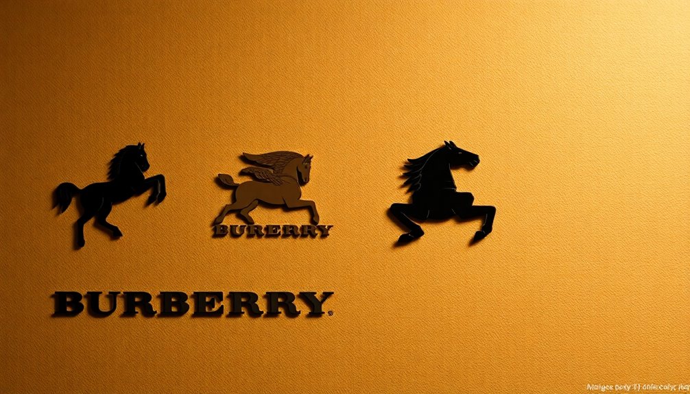
The Burberry logo tells a fascinating story of evolution and heritage. Originating in 1901 with the equestrian knight, it symbolizes honor and progress. As you explore its journey, you'll notice how the design transformed over the decades, embracing modern aesthetics while staying rooted in tradition. In 1968, a sleek font modernized the look, while 2023 welcomed back the knight in a bold new color. Each change reflects the brand's commitment to quality and adaptability, keeping it relevant in today's luxury market. If you're curious about how these shifts impact Burberry's identity, there's much more to uncover.
Key Takeaways
- The Burberry logo was first introduced in 1901, featuring an equestrian knight symbolizing honor and progress.
- Major redesigns in 1968 and 2018 modernized the logo, adapting to changing design trends and consumer preferences.
- In 2023, Burberry reintroduced the equestrian knight logo, merging traditional elements with a contemporary electric blue color.
- Each logo evolution reflects Burberry's commitment to balancing heritage with modernity while enhancing brand recognition and consumer loyalty.
- The logo's design changes, including color and typography, communicate Burberry's values of sophistication, power, and British heritage.
Origins of Burberry
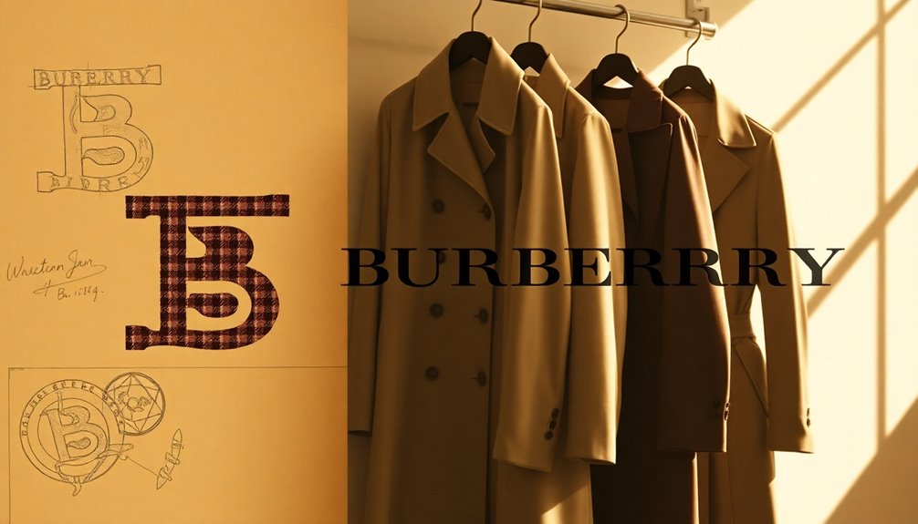
When Thomas Burberry founded the brand in 1856, he aimed to create high-quality outdoor clothing that would stand the test of time. You see, his vision was rooted in practicality, catering to the needs of those who ventured into the great outdoors.
In 1879, he introduced gabardine, a revolutionary fabric that offered durability and weather resistance, setting Burberry apart in the fashion landscape. By 1891, the opening of the first store in London marked a significant leap forward, allowing you to experience the brand's innovative designs firsthand.
Over the years, Burberry evolved, but its core commitment to craftsmanship and quality remained unwavering. This solid foundation laid the groundwork for the iconic status the brand enjoys today, shaping its identity in the luxury market.
The Birth of the Logo
In 1901, Burberry revealed its first logo, a distinctive emblem featuring an equestrian knight that symbolized honor and progress. This design was more than just a graphic; it represented the brand's values and commitment to quality.
Accompanying the knight was the word "Prorsum," which means "forward" in Latin, underscoring Burberry's aspiration for innovation. The striking red color of the logo made it eye-catching, helping to establish a strong visual identity.
As you look back at this emblem, you see how it laid the foundation for Burberry's brand recognition and heritage. This logo marked the beginning of a journey, setting the stage for how Burberry would evolve while remaining rooted in its core principles.
Evolution of Design
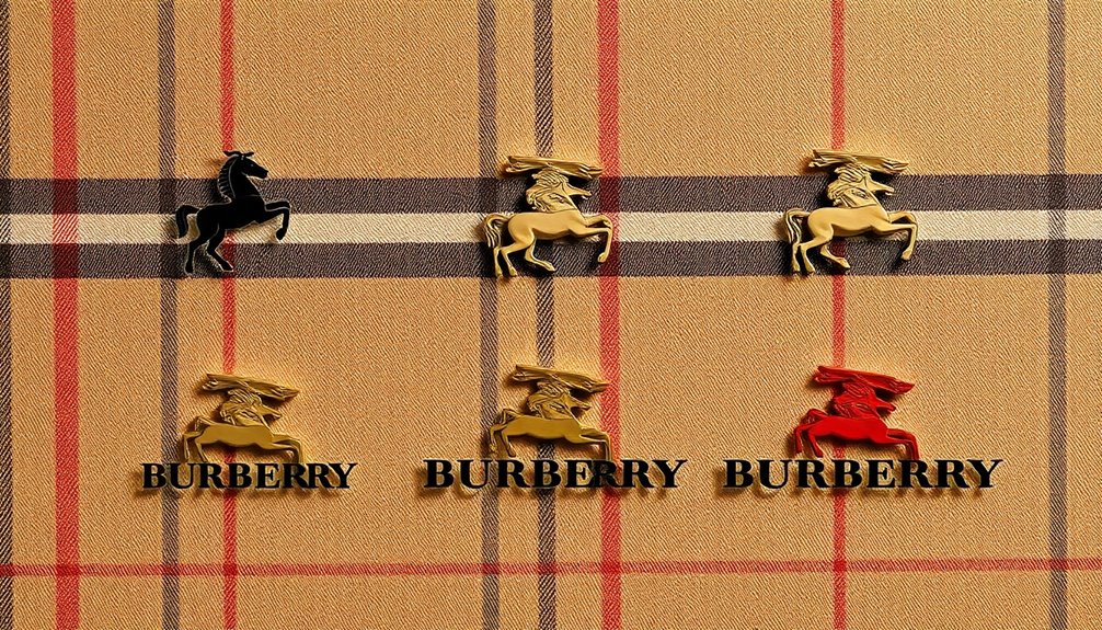
As Burberry moved through the decades, its logo underwent significant transformations that reflected both changing design trends and the brand's evolving identity.
You'll notice how each redesign captures the spirit of its time while maintaining links to its heritage. The shift from ornate details to modern simplicity showcases adaptability.
Key changes included:
- 1901: The original equestrian knight logo emphasizing honor.
- 1968: Simplification to a sleek sans-serif font.
- 2018: Introduction of interlocking TB initials, omitting the knight.
- 2022: Reinstatement of the knight with a modern serif typeface.
- 2023: Return to the equestrian knight, highlighted in electric blue.
These evolutions tell a story of Burberry's commitment to both tradition and contemporary aesthetics.
Impact on Brand Identity
Burberry's logo evolution profoundly shapes its brand identity, influencing how consumers perceive the luxury label. Each redesign marks a strategic response to market trends, reinforcing Burberry's status as a trendsetter.
The simplification in 1968 modernized the brand, distancing it from past associations and inviting a fresh audience. By reintroducing the equestrian knight in 2023, you see a commitment to heritage that resonates with long-time fans.
This balancing act between tradition and modernity is essential for maintaining consumer loyalty. The logos not only reflect changing aesthetics but also convey Burberry's values and aspirations, ensuring the brand remains relevant in a competitive market.
Ultimately, these logo changes are critical in shaping your perception and loyalty to Burberry.
Symbolism and Themes
The evolution of Burberry's logo is rich with symbolism and thematic elements that reflect the brand's heritage and values. The equestrian knight embodies power, nobility, and British heritage, while the various design choices illustrate a balance of tradition and modernity.
Here are some key themes:
- Honor and Integrity: The knight symbolizes bravery and ethical values.
- Modern Simplicity: Shifting from intricate designs to sleek silhouettes shows adaptability.
- Color Significance: The change from red to black reflects sophistication and contemporary appeal.
- Typography Evolution: Fonts have moved from ornate styles to modern serifs, enhancing clarity.
- Cultural Resonance: Each logo redesign connects with consumers seeking both tradition and innovation.
These elements collectively reinforce Burberry's identity in the luxury fashion landscape.
Strategic Redesigns
Strategic redesigns have played an essential role in Burberry's ability to adapt and thrive in the ever-changing luxury fashion market. By constantly renewing its logo, Burberry maintains relevance and strengthens its brand identity. Each redesign aligns with contemporary trends while honoring its rich heritage.
| Year | Key Features | Impact |
|---|---|---|
| 1968 | Simplified emblem, sans-serif font | Modernized brand image |
| 2018 | Bold sans-serif, TB initials | Emphasized contemporary luxury |
| 2022 | Equestrian knight, fresh serif | Blended tradition with modern flair |
These strategic moves not only reflect evolving consumer preferences but also serve to reestablish trust and highlight Burberry's commitment to both innovation and heritage.
Future of Burberry Branding
As Burberry continues to navigate the luxury fashion landscape, the future branding strategy will likely focus on balancing its storied heritage with the need for innovation.
You'll see a commitment to sustainability, incorporating eco-friendly materials and practices. Additionally, expect a stronger digital presence, engaging younger audiences through social media and e-commerce.
Here are some key elements that might shape Burberry's future branding:
- Revitalized storytelling that connects with customers emotionally.
- Collaborations with emerging designers to inject fresh creativity.
- Limited-edition releases to create exclusivity and urgency.
- Emphasis on personalization in customer experiences.
- Expansion into new markets while maintaining brand integrity.
These strategies will help Burberry remain relevant and respected in the ever-evolving luxury market.
Frequently Asked Questions
What Materials Are Used in Burberry's Logos Over the Years?
Burberry's logos over the years primarily utilized printed materials, adapting to design trends and technology.
Early logos featured vibrant inks, while later versions embraced sleek, minimalist aesthetics using high-quality printing techniques.
As the brand evolved, materials shifted from traditional paper to synthetic options for durability.
Each iteration reflects Burberry's commitment to luxury, ensuring the logos maintain their visual impact and prestige in the competitive fashion landscape.
You can see this evolution in their branding choices.
How Has Burberry's Logo Been Perceived by Different Cultures?
Burberry's logo has been perceived differently across cultures.
In Western contexts, it often symbolizes luxury and heritage, reflecting British craftsmanship. However, in some regions, it's been associated with status and exclusivity, sometimes leading to counterfeiting issues.
You might notice that its evolution resonates with consumers seeking authenticity. As Burberry balances tradition with modernity, its logo continues to adapt, appealing to diverse cultural interpretations while maintaining its prestigious reputation.
What Was the Public's Reaction to Each Logo Redesign?
When Burberry revealed each logo redesign, public reactions varied.
You might've noticed that the 1968 simplification was met with mixed feelings, as some appreciated the modern look while others missed the original.
The 2018 redesign sparked debate over its departure from tradition, but many embraced the fresh take.
The 2022 return to the equestrian knight was largely celebrated, rekindling nostalgia and pride in the brand's heritage, while the 2023 update reinforced this sentiment strongly.
How Do Fashion Trends Influence Burberry's Logo Changes?
Ever wondered how fashion trends shape iconic brands? Burberry's logo changes reflect shifting consumer tastes and cultural influences.
As style evolves, you see Burberry adapt, whether it's simplifying designs to resonate with modern aesthetics or reintroducing classic elements to connect with nostalgia.
Each redesign captures the zeitgeist, ensuring the brand remains relevant.
Are There Any Legal Issues Surrounding Burberry's Logo Design?
Yes, there are legal issues surrounding Burberry's logo design, often related to trademark disputes and copyright protection.
You might find that Burberry has aggressively defended its logo against unauthorized use, ensuring its distinctiveness in the luxury market.
Additionally, past controversies, like the association with gang culture, prompted the brand to reestablish its visual identity legally.
Staying updated on such matters is essential for understanding Burberry's strategic moves in the fashion industry.
Conclusion
As you've journeyed through the evolution of the Burberry logo, it's clear that this emblem is more than just a design—it's a symbol steeped in history and innovation. Like a classic novel that adapts with each retelling, Burberry's logo continues to resonate with modern consumers while honoring its heritage. As you look to the future, remember that this iconic brand will likely weave new tales, enchanting fashion lovers just as it has for over a century.
